
By Sam Koslowsky, Senior Analytic Consultant, Harte Hanks
Isn’t it satisfying to find a tool that makes our analytic lives easier? Have you ever wondered whether it’s possible to display the results of an analysis visually so that insight can be gleaned quickly? Have you ever seen a large table with plenty of numbers, and you are just at a loss on how to clarify what you are looking at? What approach makes interpretation stress-free?
Take the case reported in the International Journal of Market Research 1. Below is a small selection of data that was used to determine attributes and descriptors associated with well-known brands. Responses were recorded from a large sample concerning a respondent’s perceived attitude towards a variety of brands. The data was summarized, such that the number of respondents associating a brand with an attribute was calculated. Keep in mind there were about 30 brands and 20 or so attributes studied. Picture this 30 by 20 spreadsheet, and your need to summarize your findings in a concise and clear manner. Not an easy task.
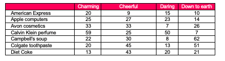
Ok, so where do you start? You might add up some of the columns, find averages, convert to percentages. This might help a bit. But it certainly doesn’t make results obvious. And it doesn’t present a picture of the relationships, at least not comfortably. Where do you go to get that view? Enter correspondence analysis (CA). Below is a result that was produced via CA.
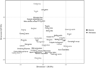
The technique presents the relative relationships between and within groups of variables.
The closer together any brands are to each other on the above visual, the more comparable they are likely to be based on the attributes. As an illustration, Porsche, Mercedes, Lexus and American Express (bottom left of graph) appear to be ‘close’ to each other, implying that consumers view them comparably.
Furthermore, results suggest that the four brands are associated with successful, imaginative, and up-to-date attributes. Nothing surprising here.
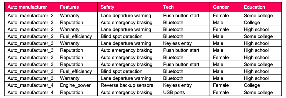
While my intent is not to delve into the technicalities of Correspondence analysis, it may be instructive to present another simple illustration with a few of the basic steps that lead up to the final graphical result. Look at the chart below which is a small sample of data that was collected to describe various attributes of five different auto manufacturers. After selecting their automobile manufacturer of choice, survey respondents were asked to select attributes most closely associated with their manufacturer. Additionally, several demographics were collected. Below is a sample of data collected.
To keep it simple, our marketing manager is looking to analyze auto manufacturer choice with education level. The first step would be to produce a contingency table, better known as a cross tab, that counts the number of occurrences of all combinations of auto manufacturer (rows) with education level (columns). This is displayed directly below.
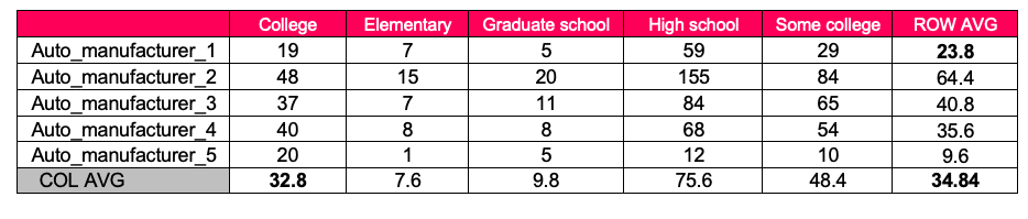
These are the actual counts. Also, please note that averages have been computed for the rows and columns.
Step two is to determine based on the AVERAGES, what would we have expected to get for each of the cells above.
Each cell’s expected value is the row average for that cell, multiplied by the column average, and divided by the overall average. So, looking at College and Auto_manufacturer_1 intersection, we get 23.8*32.8/34.84. These number have been placed in bold format to easily identify. The result of this calculation gives 22.4, which is highlighted in the expected counts table below.
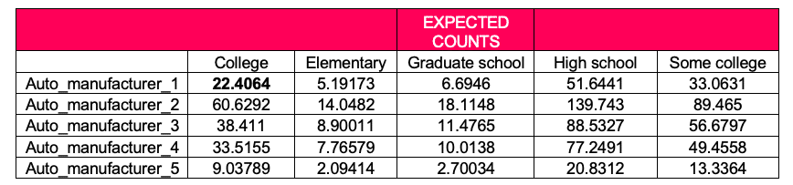
The remainder of the cells represent the expected values for the other row/cell combinations.
Our third step is to compute the residuals, that is, the difference between the actual and the expected counts. Below is a table of these residuals.
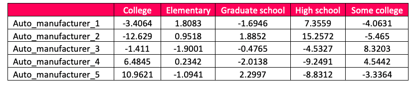
So, the actual for college/auto manufacturer intersection is 19; expected is 22.4. Subtracting these two, we arrive at -3.4064. These residuals are at the center of correspondence analysis. The residuals display the associations between the rows and columns. Here, we are examining the relationship between auto manufacturer and education. Big positive numbers suggest a more powerful positive relationship. Large negatives point to weak relationships. Let us look at the residuals for auto_manufacturer_2 . The table above show that high school has the largest positive value, 15.2. If we look at the actual counts, this strong relationship is borne out. Results are depicted in the Correspondence graph below.
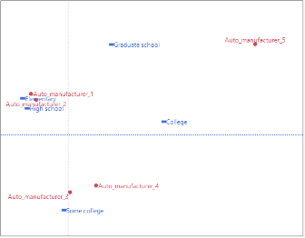
Note the relationship between Auto_manufacturer_2 and High School.
While there are considerably more involved details, the above description does provide, at least, a very basic understanding. There are certainly additional nuances in interpreting the results. Nevertheless, a sense of what Correspondence analysis can do should be evident.
While CA is less known among data scientists, it is nevertheless an appealing technique that is appropriate to many analyst’s requirements for data reduction, analysis and display.
But wait a minute. Other tools are available, as well. Are there problems with these more established approaches? Let’s briefly mention these, and see what issues there may be.
Factor analysis, a dimension reduction technique, requires a larger sample size, and is based on normal distribution assumptions. Cluster analysis can easily be abused, as there are a multitude of algorithms that can be employed, and different solutions can be presented. Multidimensional scaling, while quite similar to CA, does not permit brands and attributes to be plotted on the same graph.
So, what are some of the benefits of using correspondence analysis? By now, you are probably able to articulate some of them. The graphical visual presentation of the information enables mostly anyone to interpret the relationship between categories. Many analytic techniques require underlying assumptions to make them work. Not here. If you have a categorical variable, correspondence analysis will do the trick. Another real benefit is that the analysis effortlessly negotiates multiple variables. This is not easy to find elsewhere. Unlike many other data science tools, correspondence analysis accepts cumbersome, complex and bulky tables with multiple variables and categories and, converts these tables into a straightforward picture.
So, are there any problems with using the technique? While my explanation above is reasonably straightforward, there are some nuances that must be understood. They go beyond the scope of this article, but they relate specifically to interpretability. Not recognizing these limitations in interpretability, may cause one to misconstrue results. Correspondence analysis is only useful when there are at least two rows and two columns of data. There should be no missing data, and no negative data. If outliers exist, the end result can be skewed and distorted. Other approaches to discerning associations between rows and columns may provide a statistical measure of significance. Not here.
There is no shortage of applications for CA. For example, marketing managers may be interested in determining brands and their associated perceived attributes, as discussed above. Health care professionals need to know the relationship among symptoms and disease. Psychologists study attitudes and behaviors. Social, environmental, economics, linguistics, and archaeology applications are standard fare for CA.
You’ll find this technique available in Python, R, SAS, SPSS, and just about any other analytic related software.
With all the complex issues that we data scientists work with, it’s nice to use a tool that can make our lives considerably easier. In the introduction to “Correspondence Analysis and Data Coding with Java and R” 2, Benzécri notes of the vast opportunities available to researchers by “inexpensive means of computation that could not be dreamed of just thirty years ago.” No need to dream it. You can use it!
1 https://journals.sagepub.com/doi/10.1177/1470785318801480
2 F. Murtagh, Correspondence Analysis and Data Coding with Java and R, Boca Raton:
Chapman & Hall/CRC, 2005

Sam Koslowsky serves as Senior Analytic Consultant for Harte Hanks. Sam’s responsibilities include developing quantitative and analytic solutions for a wide variety of firms. Sam is a frequent speaker at industry conferences, a contributor to many analytic related publications, and has taught at Columbia and New York Universities. He has an undergraduate degree in mathematics, an MBA in finance from New York University, and has completed post-graduate work in statistics and operations research.